The Most Beautiful Building of This Century: the Old Parkland in Dallas
Built in 2015 as a remodel of Dallas' old hospital, the Old Parkland is, hands down, the most beautiful building of this century.
I had the pleasure of attending the UATX’s Forbidden Courses course from June 18th to the 24th. The conference featured a wide range of participants, with the youngest participants being recent high school graduates, and the oldest approaching their 30s. I participated throughout the week in the “Science and Christianity” seminar. I can safely say, my mind has never been so intensely taxed. I ate like there was a famine and ran myself to exhaustion every night. While the professors and students in attendance were imminently impressive, the architecture of the venue overawed me. I spent the first few days exploring the complex tunnels. Built in 2015, the new section of the Old Parkland, where we spent the majority of five days, is hands down the most beautiful building built in this century.
Now, I know that it does not have much competition, since we build only boxes and cubes nowadays, but I would argue it rivals buildings from other centuries as well. The Old Parkland carries a love and life that is absent even from most present attempts at traditional architecture. The attention to detail is astounding. I am reserving the most impressive room, “the Debate Chamber,” in next week’s article. This article will give an overview of the newer section of the complex where I spent the vast majority of my time.
Originally, the Old Parkland was Dallas’ hospital. After decades of disrepair, its current owner, Harlan Crow, purchased, remodeled, and converted it into the office complex that it is today. I certainly wish my office was that nice…
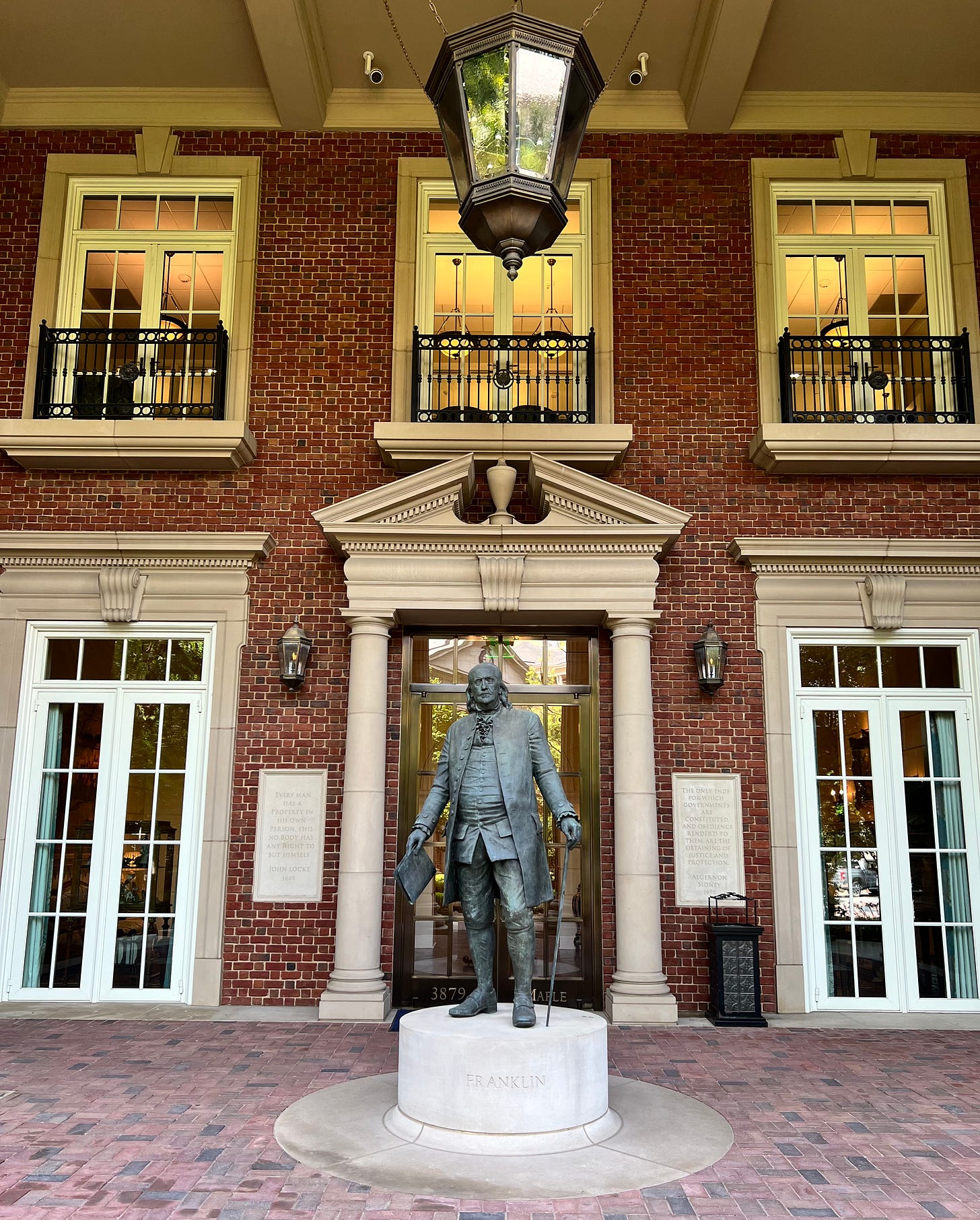
First, the portion of the Old Parkland built in 2015 is in a style reminiscent of the Federalist style. Like Monticello, it combines brick with a soft white stone. Custom bronze or brass statues of George Washington, Alexander Hamilton, and Benjamin Franklin guard the three primary buildings. These statues are surrounded by witty and somber quotations, carved into the stone of the façades. The quoted include Montesquieu, Sydney, Locke, and other influential philosophers. The rear of Franklin’s pediment is embossed with one of his witty remark from the signing of the Declaration of Independence:
“We must, indeed, all hang together, or, most assuredly, we shall all hang separately!”
Arches and pediments are liberally used throughout the complex, the embellishment makes use of both straight lines and curves for subtle differences that elevate and compliment the striking contrasts. Overall, the sense is of a lively order. It seems that the whole building could spring to life if it so desired, yet it simply choses not to.
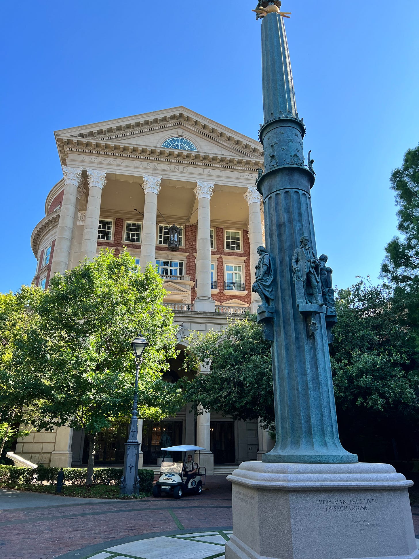
A circular courtyard at the center of the three buildings features a monument to Adam Smith, John Locke, Thomas Jefferson, and (if memory serves me right) John Adams. Atop the monument (which I accidentally cut off) stand Eos, goddess of the dawn. The names of the great Western philosophers encircle the monument, inlaid in a polished brass at the edge of the courtyard. Trees abounded throughout, so I felt like I was traveling from a palace, through the woods, to another palace whenever I walked outside. This is quite an impressive accomplishment, since the entire complex is very compact, being only 0.045 square miles in area.
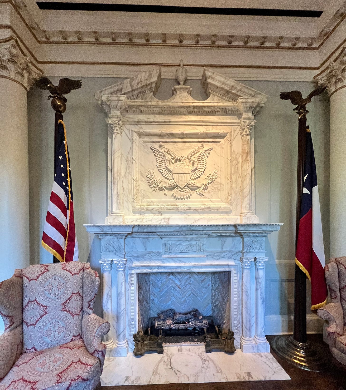
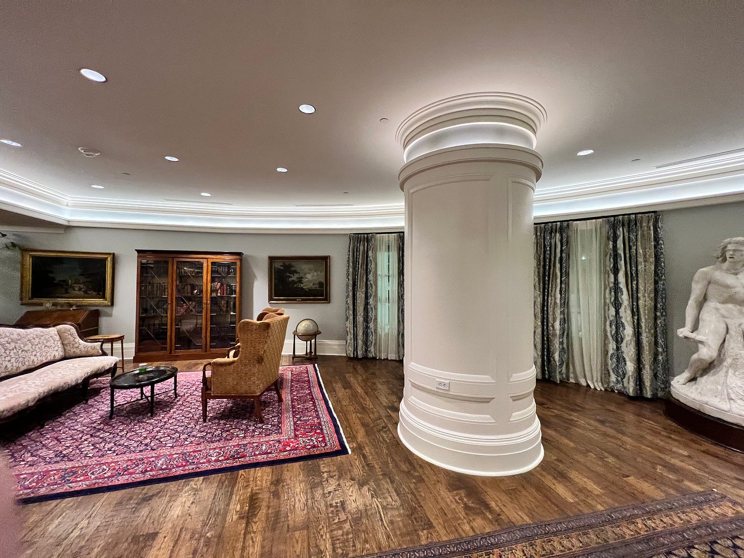
As one entered each building, one came upon a uniquely designed and decorated entry and sitting area. The furniture here was opulent and the fireplaces magnificent. Each room featured different colors, patterns, forms, embellishment, accents, furniture, and art. Each room became a piece of art in-and-of-itself.
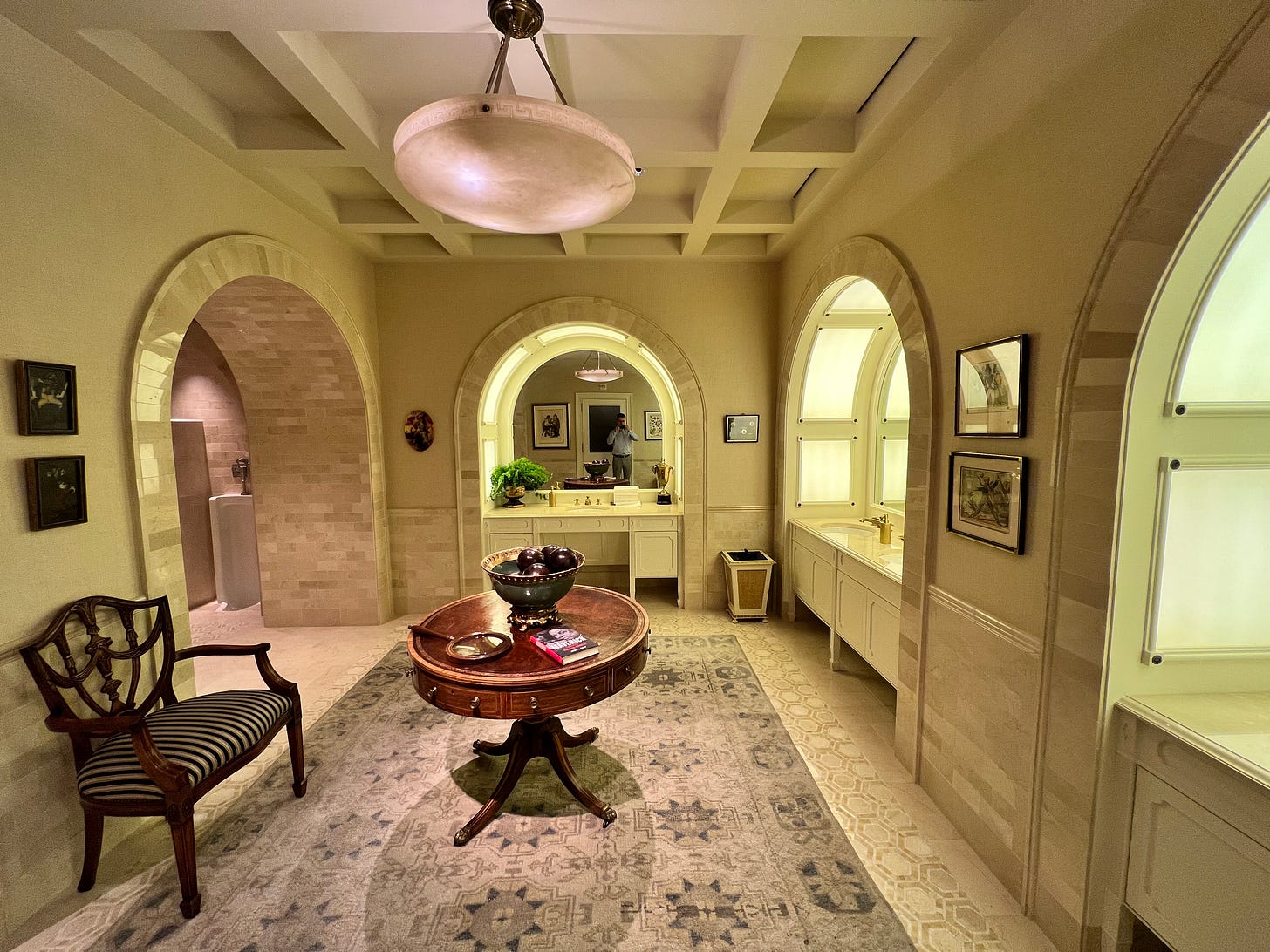
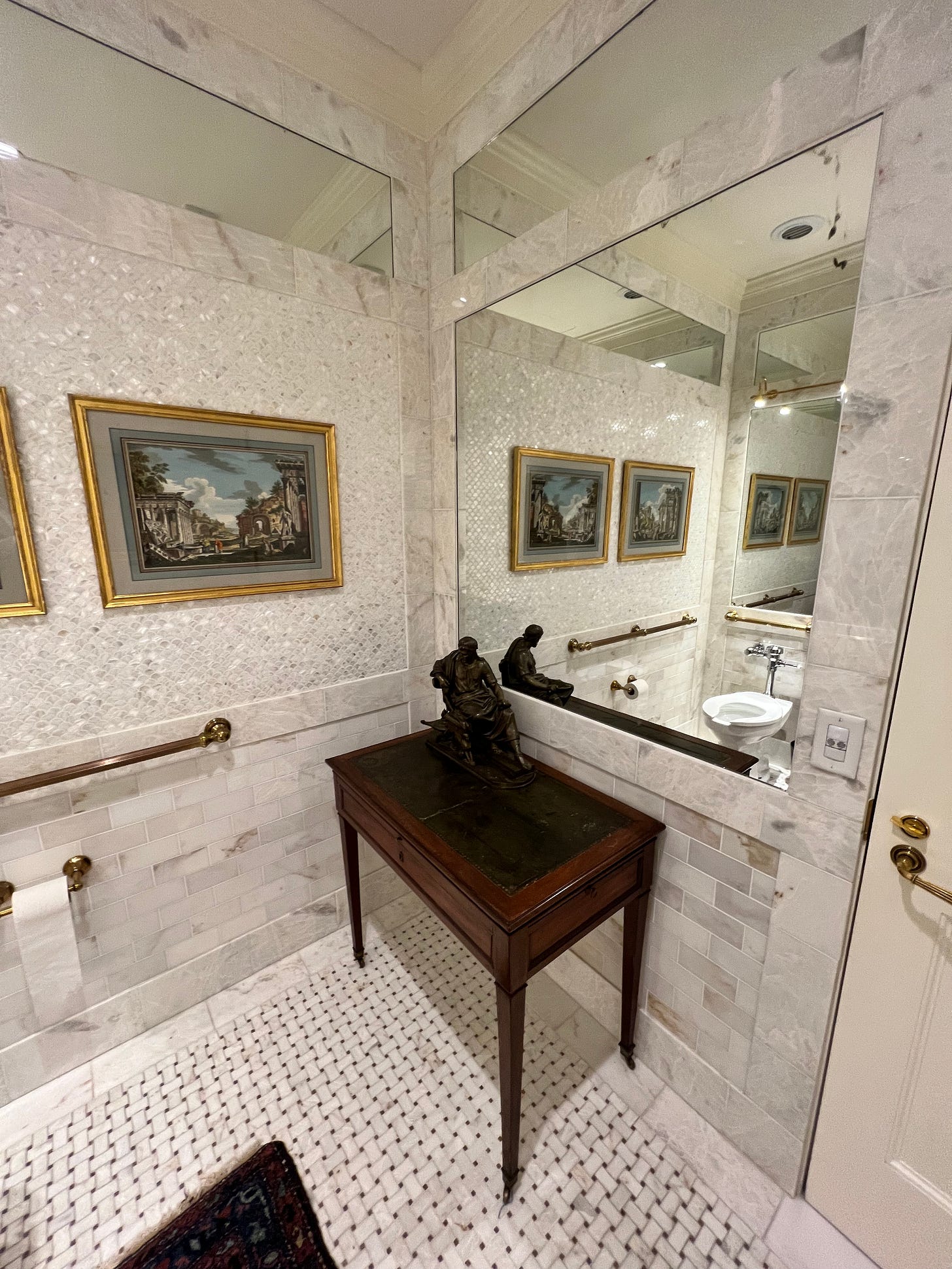
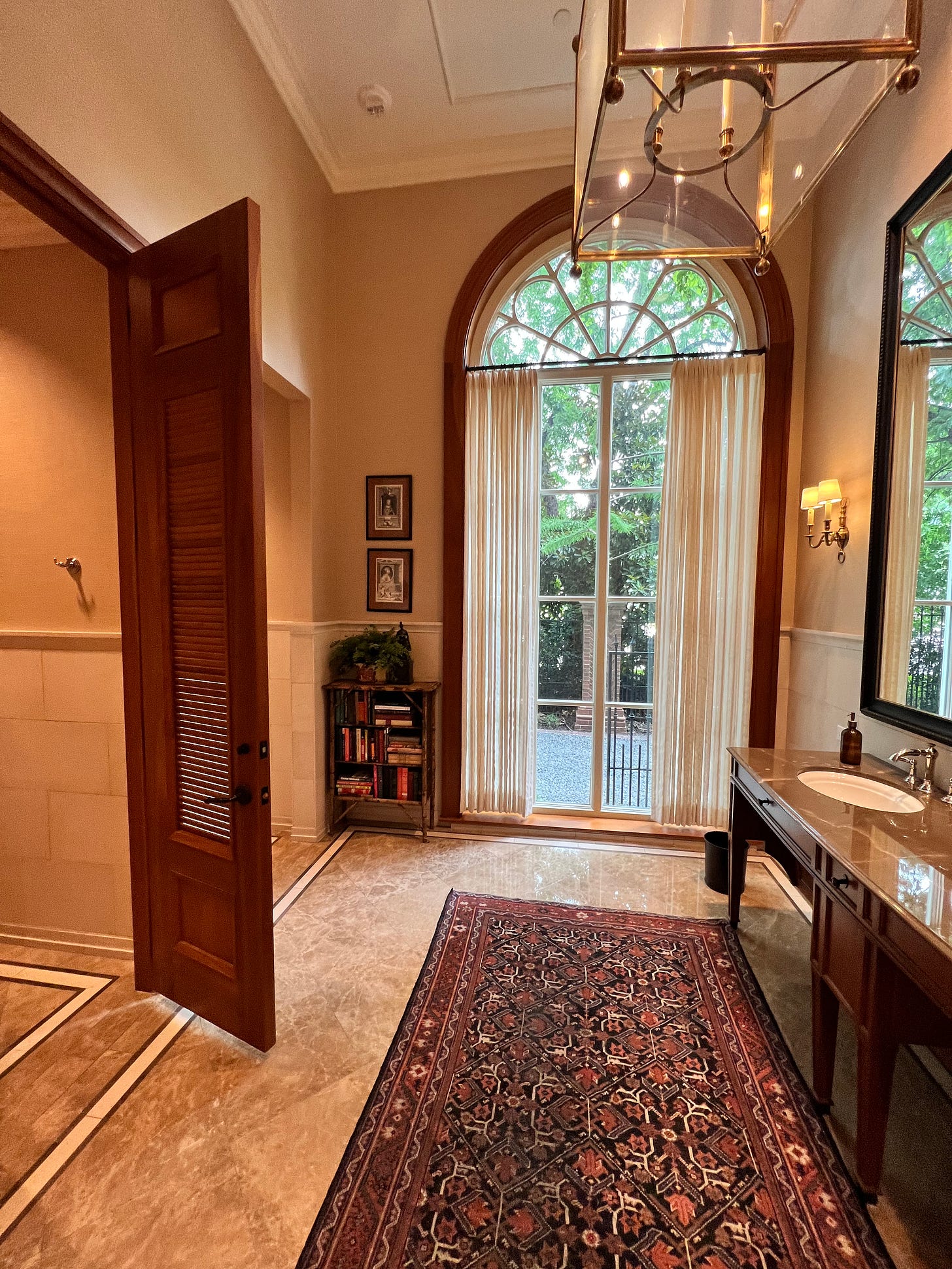
When I say no detail was neglected, I truly mean it. Each bathroom was uniquely designed and exquisitely done. I did not check if the women’s restrooms matched or complimented the men’s.
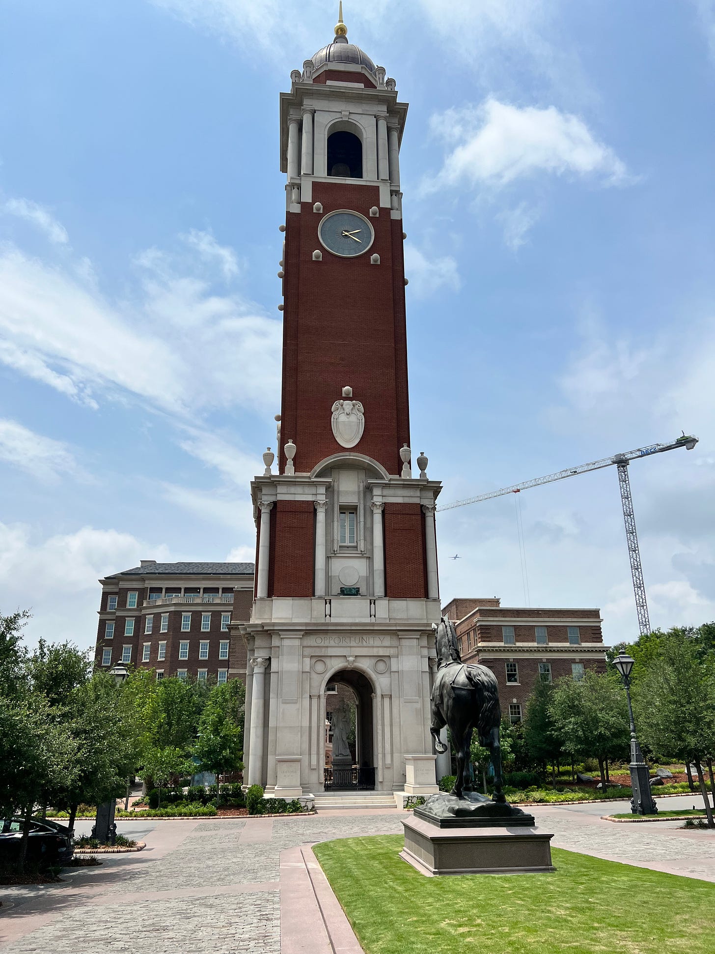
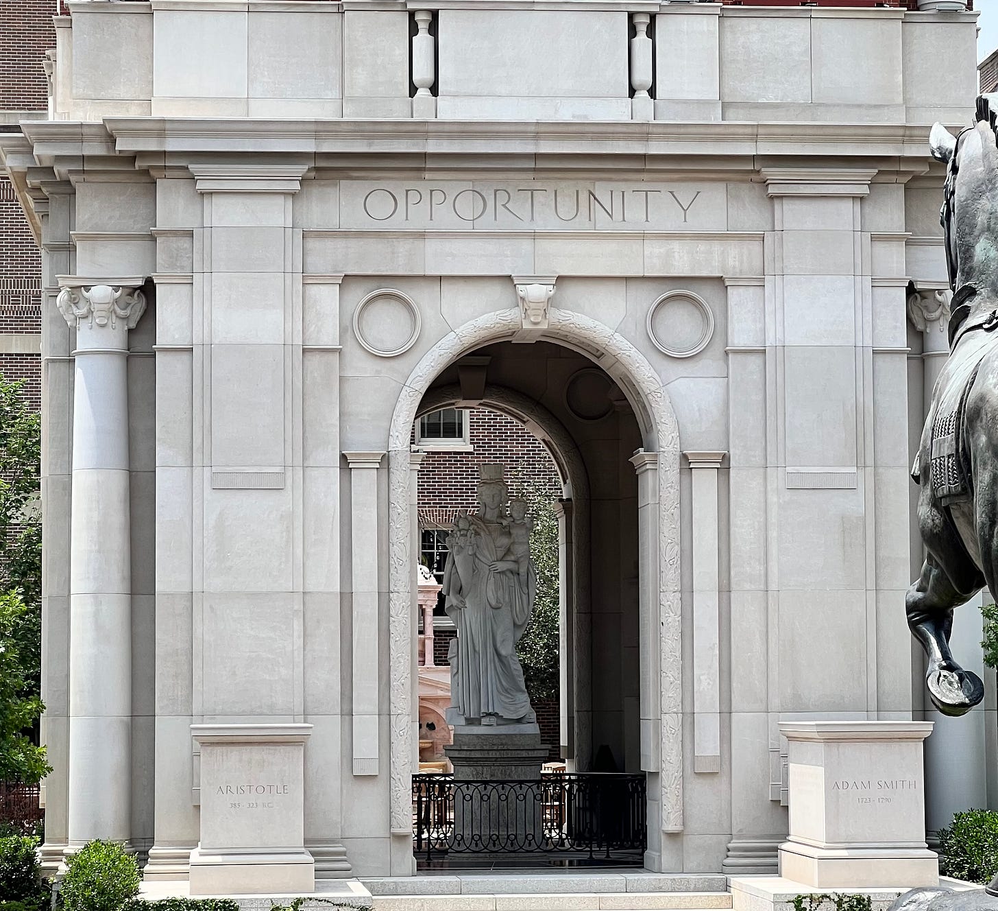
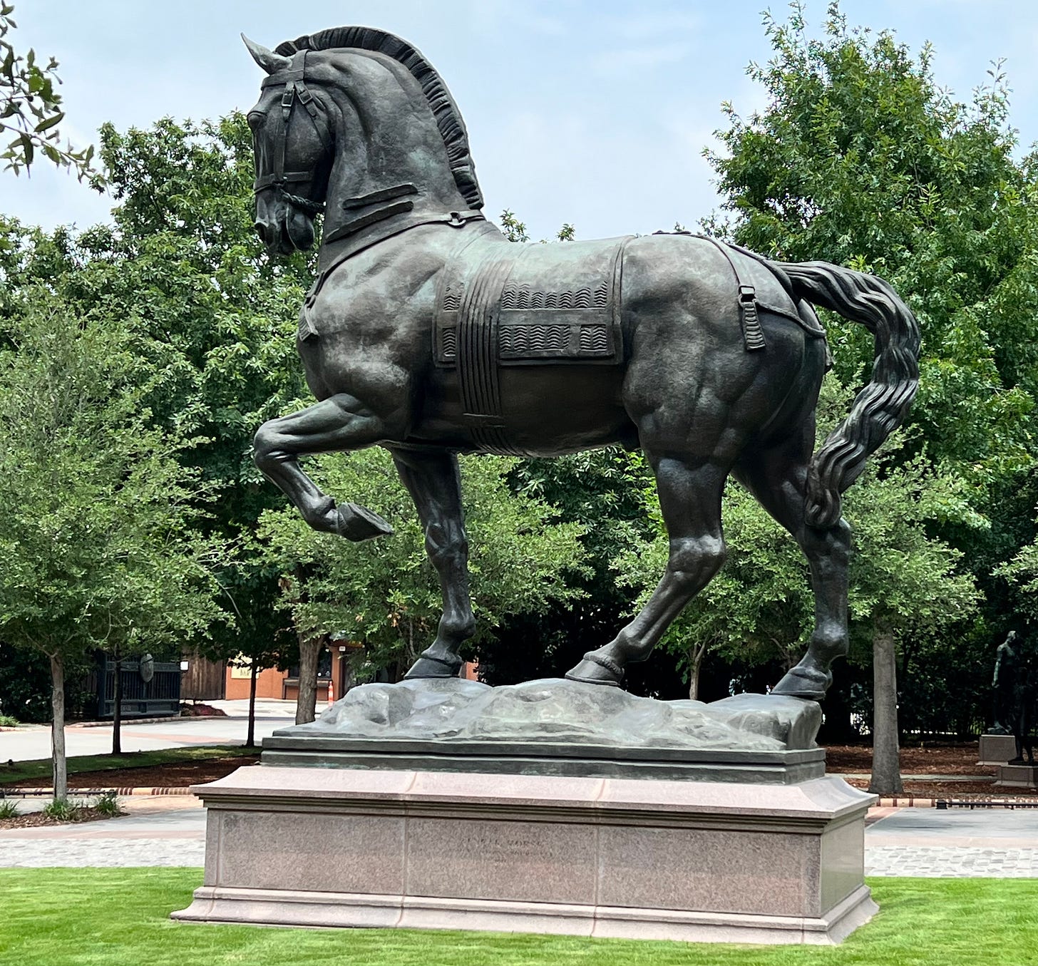
At the far end of the complex, there stands a large and impressive clock tower. At its base, which appears like the Arc du Triumph, there stands a statue perhaps twice my height. At first I thought this was a statue of the Madonna and Child, though I cannot say since she holds a cornucopia. Facing them stands an imposing and impressive statue of a horse.
This complex embodies what architecture should be. All of the great and ancient traditions of the United States are made material and symbolic throughout the complex. It is easy to be a proud, patriotic American when surrounded by self-evident examples of our greatness. It truly felt, as I tried to describe in “the Music of Architecture,” as if our history was made manifest in the present through the architecture and art.
The building also continuously yields up joyous surprises that push negative emotions out of its occupants. I think this best conveyed by example. As we were trying to find our way to class one day, we got lost and had to ask a janitor for help. He laughed, pointed us in the right direction. He told us not to worry when we apologized for the inconvenience; people who had worked there for 10 years still got lost. The intricate beauty of the place simply seemed to make people more light-hearted and understanding of mistakes.
Further, the designer was not afraid of bold choices. I regretfully forgot to photograph the “fairy door.” One of the entrances from the parking garage into the upper subterranean level was fantasy themed, thus its name.
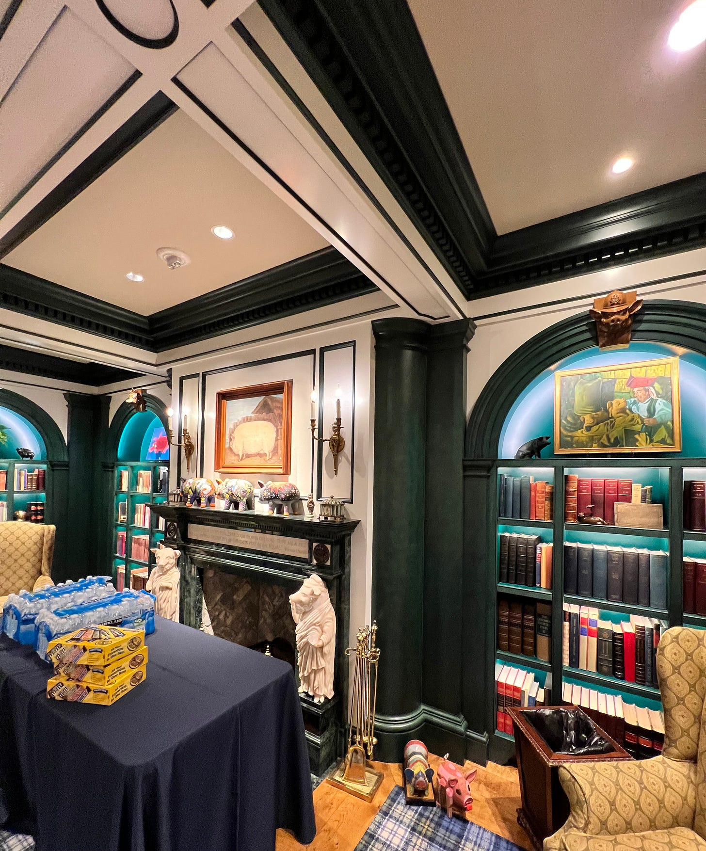
Hidden away down a side passage, there was the “pig room.” A tasteful green and white library filled with pig-themed statues and quotes. I wish I had taken more pictures, but I did not want to post pictures of other people. In the center was a well-polished wooden conference table. The ceiling, as you can see, is coffered with green accents. I quite liked it, as I had already considered dark green and white as an excellent pallet for fusing traditional styles with the modern taste for sharp contrasts. The green marble mantle is also a perfect blend of white and green.
The designer also made good use of backlighting in the moulding below and along bookshelves, like in the pig room. This both emphasized the bookshelves scattered throughout the complex, and significantly contributed to the light and airy feel of the subterranean rooms. This has reinforced my intuition that light fixtures are fertile ground for experimentation in combining modern technology with traditional styles.
The Old Parkland has also helped me refine my opinions of a more masculine style by providing concrete examples. I am going to hold off, however, until I have gathered more examples.
I spent almost the entire conference one or two stories below ground, but the lighting and décor was so beautiful that I hardly noticed. The doors to the below-ground parking garage were glass covered in shear cloth, giving the appearance that one was at ground level.
I will offer the light critique that peering through office windows, they were near universally minimalist and modernist. I respect the rights of the businesses to design their offices as they see fit, but really? Did they have to have such a conventional office in such a unique place? Additionally, there was one large room added onto one of the old hospital buildings that was purely glass and steel supports. It was luckily designed in such a way that it did not destroy the composition of the whole, but, to put it frankly, the idea that the addition had to be modernist to make clear which rooms were original and which new falls flat. A change in materials or a change to a complimentary yet distinct style would have sufficed.
I asked around of the Forbidden Courses participants to gauge their opinion of the Old Parkland. Curiously, the few that professed a greater-than-passing interest in architecture were less taken by the complex than those who simply said “I like beautiful buildings.” This speaks to what I have heard from many sources: that architects are taught to revile tradition, yet the common Man longs for tradition.
This complex is inspiring, and I wish I had taken even more photos than I did. Looking back at my 160 photos, I am kicking myself over the places and perspectives that I failed to adequately capture.
The Old Parkland is certainly not a good case study for what the average building should be. But what astounds me is how few vanity projects there are like it. It is an example of the greatness that we, as a culture, should strive for and encourage. It is an example of what we can achieve with our wealth and productivity.


